Seller Premium Service
Revenue increase through recalibrated membership scheme and commission adjustment.
Click one of these contents to direct to a certain section
What is the project about?
Business Problem
The current setup does not allow Tokopedia to charge different commissions for different categories, meanwhile each has different margin structures across the value chain.
Our closest competitor has already introduced a category specific commission structure and auto-upgrade membership scheme which is deemed more profitable, therefore there's a competitive need to accommodate these improvements.
Objective
Ensure Sellers are well-communicated seamlessly regarding the commission change
Remodel membership registration page to comply with the new Seller membership upgrade scheme
Redesign the microsite and other impacted pages to align with the new commission change and membership scheme
Solution
A system adjustment requires a thorough and seamless flow of information uniformity, hence these gradual steps for the solution;
Communication period; a design dedicated to inform the necessary adjustment, 30 days before the day of happening
D-Day onwards; the final design once the adjustments have been implemented
✅ Impact
This project was hugely impacted Tokopedia as a whole business-wise. It promotes feasibility within its ecosystem and increases revenue to ultimately provide more varying and beneficial packages for sellers.
The new commission category-based scheme would also help us grow our revenues by ~30% while not necessarily impacting sellers who cannot afford to pay higher commissions.
How was the
situation
during the
project?
To secure Tokopedia Seller’s ecosystem sustainability, this project was initiated to restructure Tokopedia Seller’s membership mechanism (PM auto-upgrade to PM PRO) and change the commission rate to category-based charging.
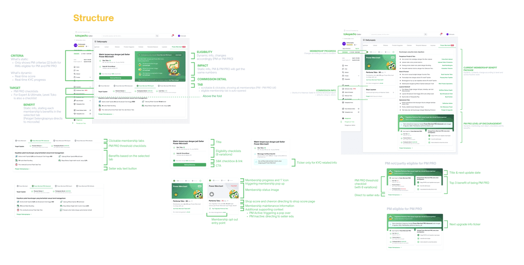
My responsibility scope was defining the page structure for the membership landing page and its registration page on D-Day onwards and all the use cases. This phase took a lot of back-and-forth feedback loop from PMs, tech, and designers, while being in a short period of time.
The other design I worked on, which was the category & commission detail pop up, also required a constantly changing adjustment, hence a thorough over-communication with business team, too.
Until the release dates (18 May & 6 June), those post-launch weeks were bombarded with bug-checking that I fairly enjoy doing.
UX Strategy

[1] Competitor Analysis and User Research
Tactic: An in-depth interview, competitor analysis, and mapping out membership flows provided a baseline understanding of industry standards.
Outcome: A solid understanding of both the competitive landscape and direct user needs.
[2] Iterative Design and Feedback Loop
Tactic: Rigorous back-and-forth feedback loop in defining the page structure for the Premium Membership (PM) Page and its registration process, in a tight timeline.
Outcome: Ensured that the design was both functional and aesthetically pleasing, while also meeting the technical and business requirements efficiently.

[3] Managing Dynamic Requirements and Communication
Tactic: Maintained thorough over-communication with the business team to accommodate changing requirements and ensure that every modification was aligned with the goals.
Outcome: Mitigated the risks associated with frequent requirement changes, ensuring that the final design remained aligned with strategic objectives
Challenges & Learnings
[1] Rapid Decision-Making
Faced with a timeline issue from the Android development team, I quickly—less than a day—adapted by prioritizing which features should be included in the MVP and which could be deferred to the ultimate release.
The project stayed on track despite unexpected challenges, preventing delays and maintaining project momentum.
[2] High Ownership and Team Collaboration
Taking full ownership allowed me to manage expectations effectively and ensure that every aspect of the project was executed to the highest standard. The supportive team environment played a key role in overcoming obstacles and achieving project goals.
I learned how an effective and healthy team should be like, considering the counterparts I worked with were setting a high benchmark on the project workflow and dynamics.
Now let's look deeper
into the design
Learn how the design looks. Enjoy!
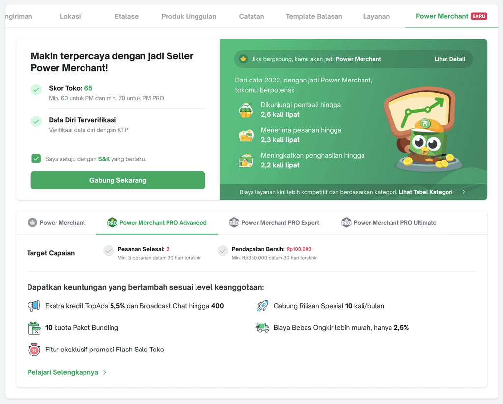
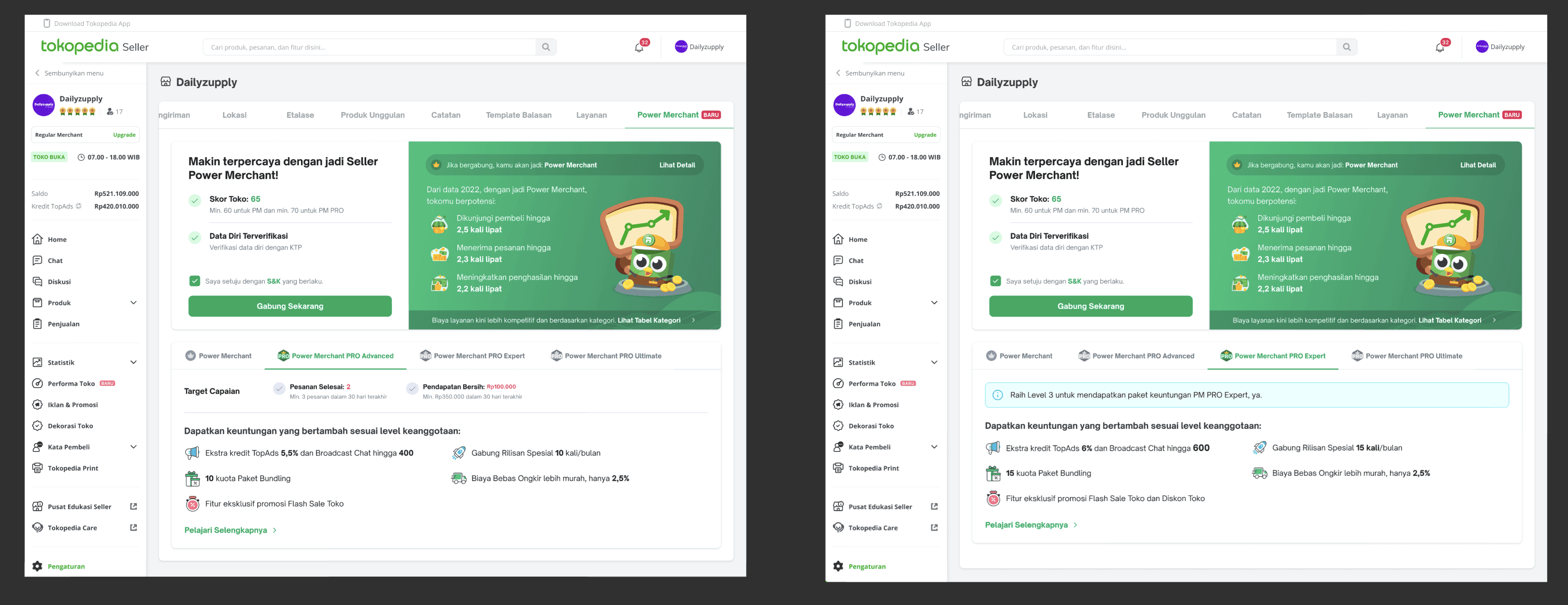
As a Seller, I can check my eligibility to be upgraded into a higher membership level.
As a Seller, after clicking 'Register', I can directly be upgraded and redirected to membership landing page.
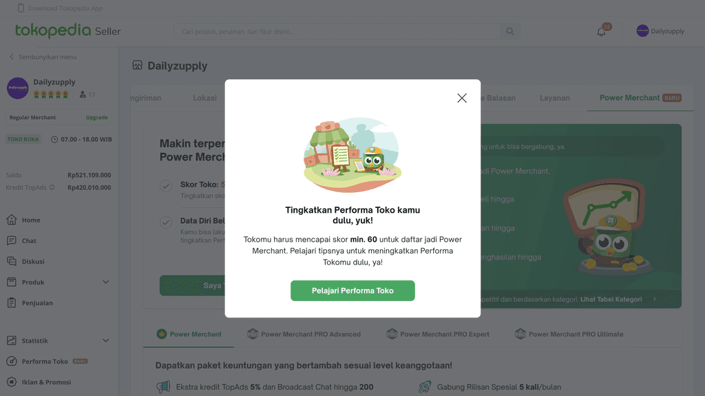
As a Seller, after clicking 'Register, I can be informed on how to fulfill my requirements to be upgraded.
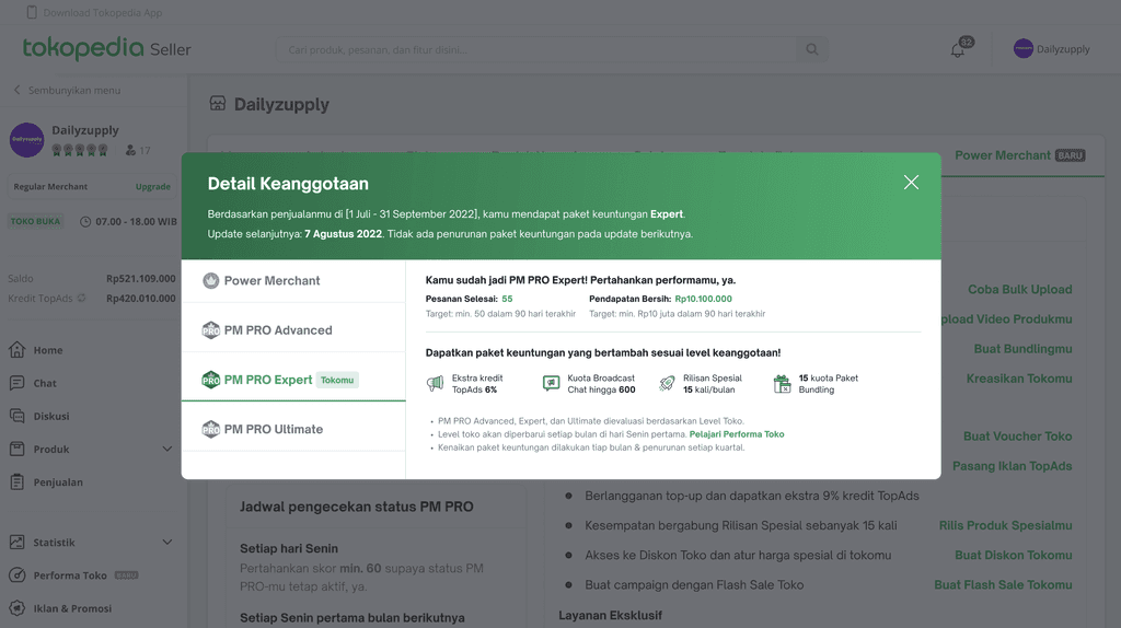
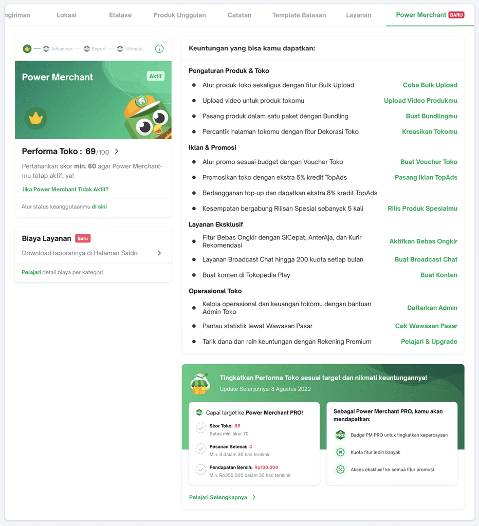
As a Seller, after successfully being upgraded, I can check the membership detail, to keep my status on track.
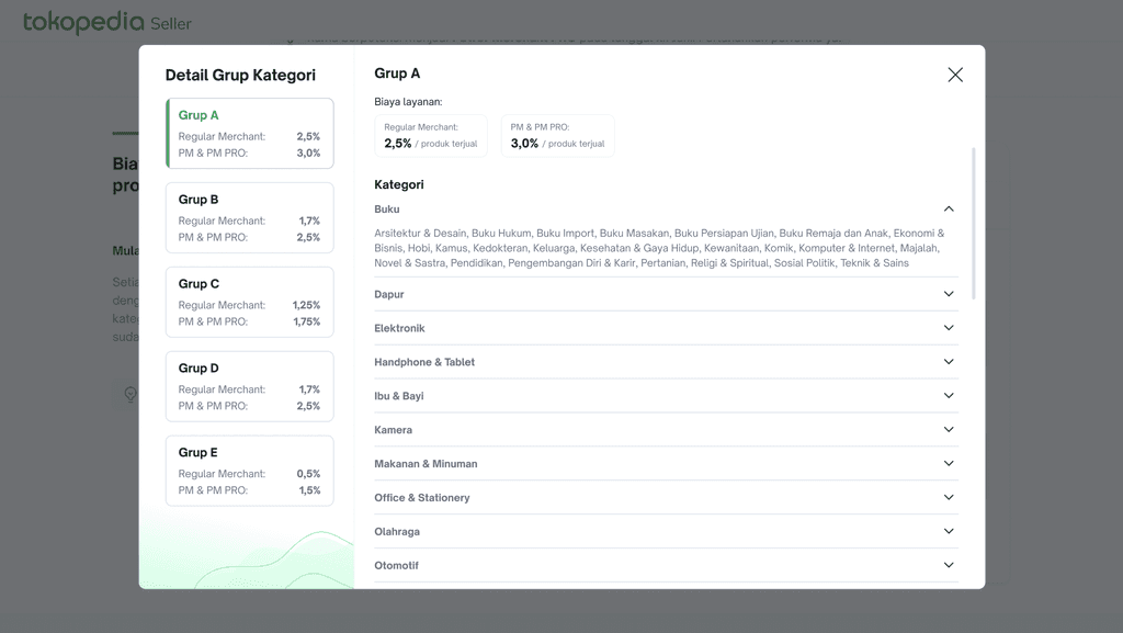
As a Seller, I can see where my product category lies in the new commission charge scheme.
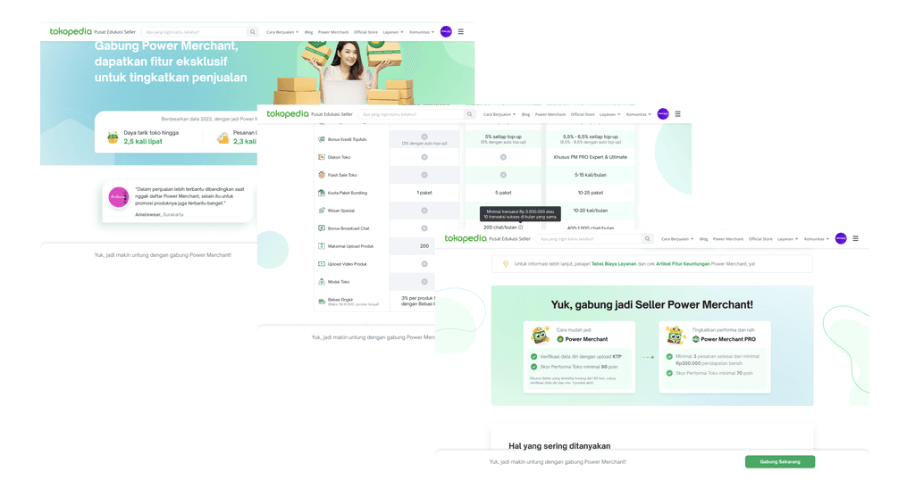
As a Seller, I can understand and compare the benefits from these memberships, see testimonials from other Sellers, and learn how to upgrade.
See microsite ✅ here ✅
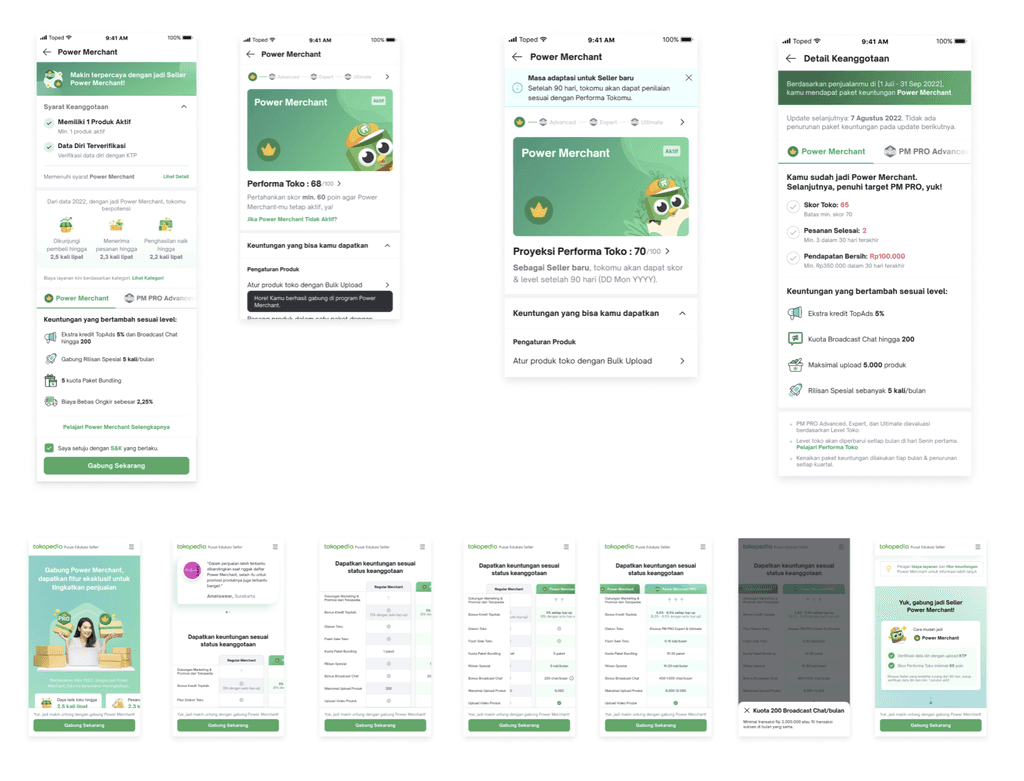
As a Seller, I can do all those actions aforementioned in my mobile app.
Thank you for reading 😺
————————————
See other projects?
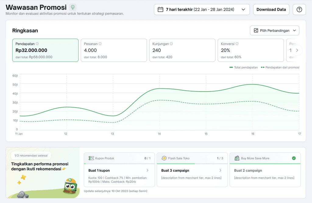
Promotion Analytics
Empowering sellers through comprehensive and strategic promotional decision-making.
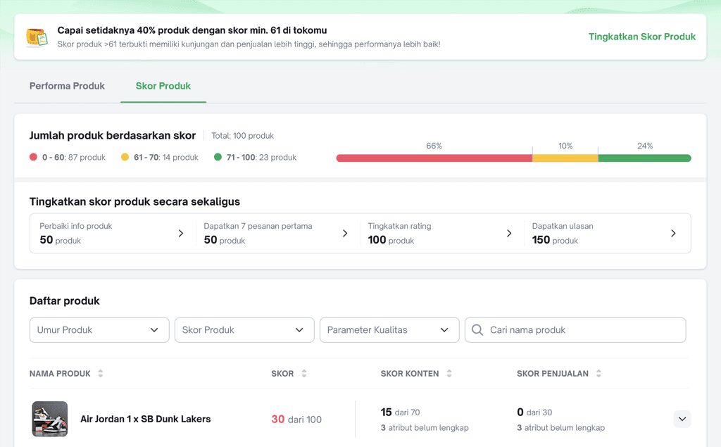
Product Scoring
Helping Sellers achieving TIV growth through improved Product Scoring system.
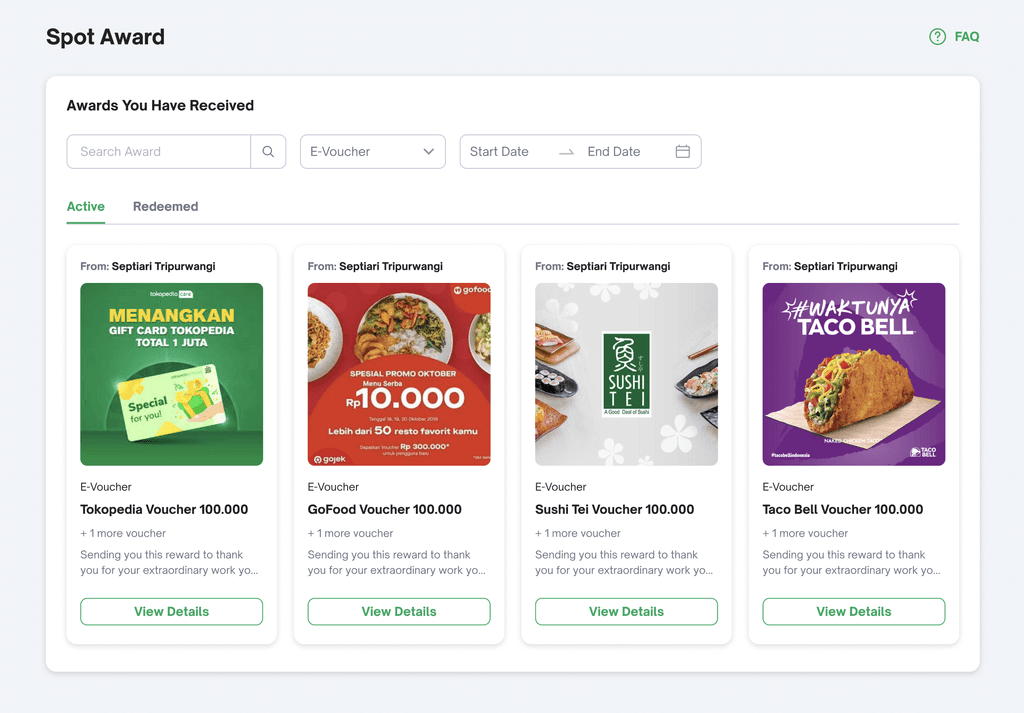
Internal Tools: Spot Award
A recognition ecosystem developed to enable leaders to appreciate their teams.